画个大圆套小圆
1 | <div class="container"> |
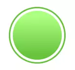
然后我们得到了这个
画遮盖层并让它扭起来
1 | <div class="container"> |
然后就变成了这样(为了看的效果更好,原谅我使用的大红色)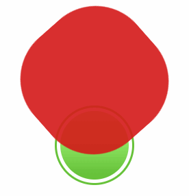
裁剪
1 | .container { |
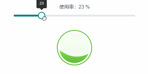
成品就酱婶的了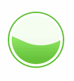
完善
波浪的高度完全是受wave-mask的top属性影响的,所以要动态变更悬浮球状态只需要计算然后相应的改变top的值就可以了,然后稍微完善一下代码
<template>
  <div class="home">
    <div class="container" :class="{ warning: parseInt(usingRate) > 60, danger: parseInt(usingRate) > 80 }">
      <div class="wave"></div>
      <div class="wave-mask" :style="`top: ${40 - parseInt(usingRate)}px`"></div>
      <div class="val">{{usingRate}}</div>
    </div>
    <div class="using-slider">
      <span>使用率:{{usingRate}} %</span>
      <br />
      <input type="range" value="0" max="100" v-model="usingRate">
    </div>
  </div>
</template>

<script>
export default {
  data () {
    return {
      usingRate: 0
    }
  }
}
</script>

<style lang="scss" scoped>
.container {
  width: 100px;
  height: 100px;
  border-radius: 50%;
  border: 3px solid #67c23a;
  background: #ffffff;
  overflow: hidden;
  position: absolute;
  top: 50%;
  left: 50%;
  transform: translate(-50%, -50%);
  padding: 5px;
  .wave {
    position: relative;
    width: 100px;
    height: 100px;
    background-image: linear-gradient(-180deg, #aaff80 13%, #67c23a 91%);
    border-radius: 50%;
  }
  .val{
      position: absolute;
      left: 0px;
      top: 0px;width: 116px;
    height: 116px;
    z-index: 100;
      font-size: 33px;
      text-align: center;
      line-height: 116px;
  }
  .wave-mask {
    position: absolute;
    width: 200px;
    height: 200px;
    top: 0;
    left: 50%;
    border-radius: 40%;
    background-color: rgba(255, 255, 255, 0.9);
    transform: translate(-50%, -70%) rotate(0);
    animation: toRotate 4s linear -5s infinite;
    z-index: 20;
  }

  &.warning {
    border: 3px solid #e6a23c;
    .wave {
      background-image: linear-gradient(-180deg, #f0c78a 13%, #e6a23c 91%);
    }
    &.danger {
      border: 3px solid #f56c6c;
      .wave {
        background-image: linear-gradient(-180deg, #f78989 13%, #f56c6c 91%);
      }
    }
  }
}
.using-slider {
  width: 400px;
  margin: 0 auto;
}

@keyframes toRotate {
  50% {
    transform: translate(-50%, -70%) rotate(180deg);
  }
  100% {
    transform: translate(-50%, -70%) rotate(360deg);
  }
}
</style>