阅读目录
- 方法一:position加margin
- 方法二: diaplay:table-cell
- 方法三:position加 transform
- 方法四:flex;align-items: center;justify-content: center
- 方法五:display:flex;margin:auto
- 方法六:纯position
这种css布局平时用的比较多,也是面试题常出的一个题,网上一搜一大丢,不过还是想自己总结一下。
这种方法比较多,本文只总结其中的几种,以便加深印象。
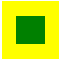
效果图都为这个:

方法一:position加margin
/**html**/
<div class="wrap">
    <div class="center"></div>
</div>

/**css**/
.wrap {
    width: 200px;
    height: 200px;
    background: yellow;
    position: relative;
}
.wrap .center {
    width: 100px;
    height: 100px;
    background: green;
    margin: auto;
    position: absolute;
    left: 0;
    right: 0;
    top: 0;
    bottom: 0;
}
兼容性:主流浏览器均支持,IE6不支持
方法二: diaplay:table-cell
<!-- html -->
<div class="wrap">
     <div class="center"></div>
</div>

/*css*/
.wrap{
    width: 200px;
    height: 200px;
    background: yellow;
    display: table-cell;
    vertical-align: middle;
    text-align: center;
}
.center{
    display: inline-block;
    vertical-align: middle;
    width: 100px;
    height: 100px;
    background: green;
}
兼容性:由于display:table-cell的原因,IE6\7不兼容
方法三:position加 transform
<!-- html -->
<div class="wrap">
    <div class="center"></div>
</div>

/* css */
.wrap {
    position: relative;
    background: yellow;
    width: 200px;
    height: 200px;}

.center {
    position: absolute;
    background: green;
    top:50%;
    left:50%;
    -webkit-transform:translate(-50%,-50%);
    transform:translate(-50%,-50%);
    width: 100px;
    height: 100px;
}
兼容性:ie9以下不支持 transform,手机端表现的比较好。
方法四:flex;align-items: center;justify-content: center
<!-- html -->
<div class="wrap">
    <div class="center"></div>
</div>

/* css */
.wrap {
    background: yellow;
    width: 200px;
    height: 200px;
    display: flex;
    align-items: center;
    justify-content: center;
}

.center {
    background: green;
    width: 100px;
    height: 100px;
}
移动端首选
方法五:display:flex;margin:auto
<!-- html -->
<div class="wrap">
    <div class="center"></div>
</div>

/* css */
.wrap {
    background: yellow;
    width: 200px;
    height: 200px;
    display: flex;
}

.center {
    background: green;
    width: 100px;
    height: 100px;
    margin: auto;
}
移动端首选
方法六:纯position
<!-- html -->
<div class="wrap">
    <div class="center"></div>
</div>

/* css */
.wrap {
    background: yellow;
    width: 200px;
    height: 200px;
    position: relative;
}
/**方法一**/
.center {
    background: green;
    position: absolute;
    width: 100px;
    height: 100px;
    left: 50px;
    top: 50px;

}
/**方法二**/
.center {
    background: green;
    position: absolute;
    width: 100px;
    height: 100px;
    left: 50%;
    top: 50%;
  margin-left:-50px;
  margin-top:-50px;
}
兼容性:适用于所有浏览器
方法六中的方法一计算公式如下:
子元素(conter)的left值计算公式:left=(父元素的宽 - 子元素的宽 ) / 2=(200-100) / 2=50px;
子元素(conter)的top值计算公式:top=(父元素的高 - 子元素的高 ) / 2=(200-100) / 2=50px;
方法二计算公式:
left值固定为50%;
子元素的margin-left= -(子元素的宽/2)=-100/2= -50px;
top值也一样,固定为50%
子元素的margin-top= -(子元素的高/2)=-100/2= -50px;